


Graphics Design


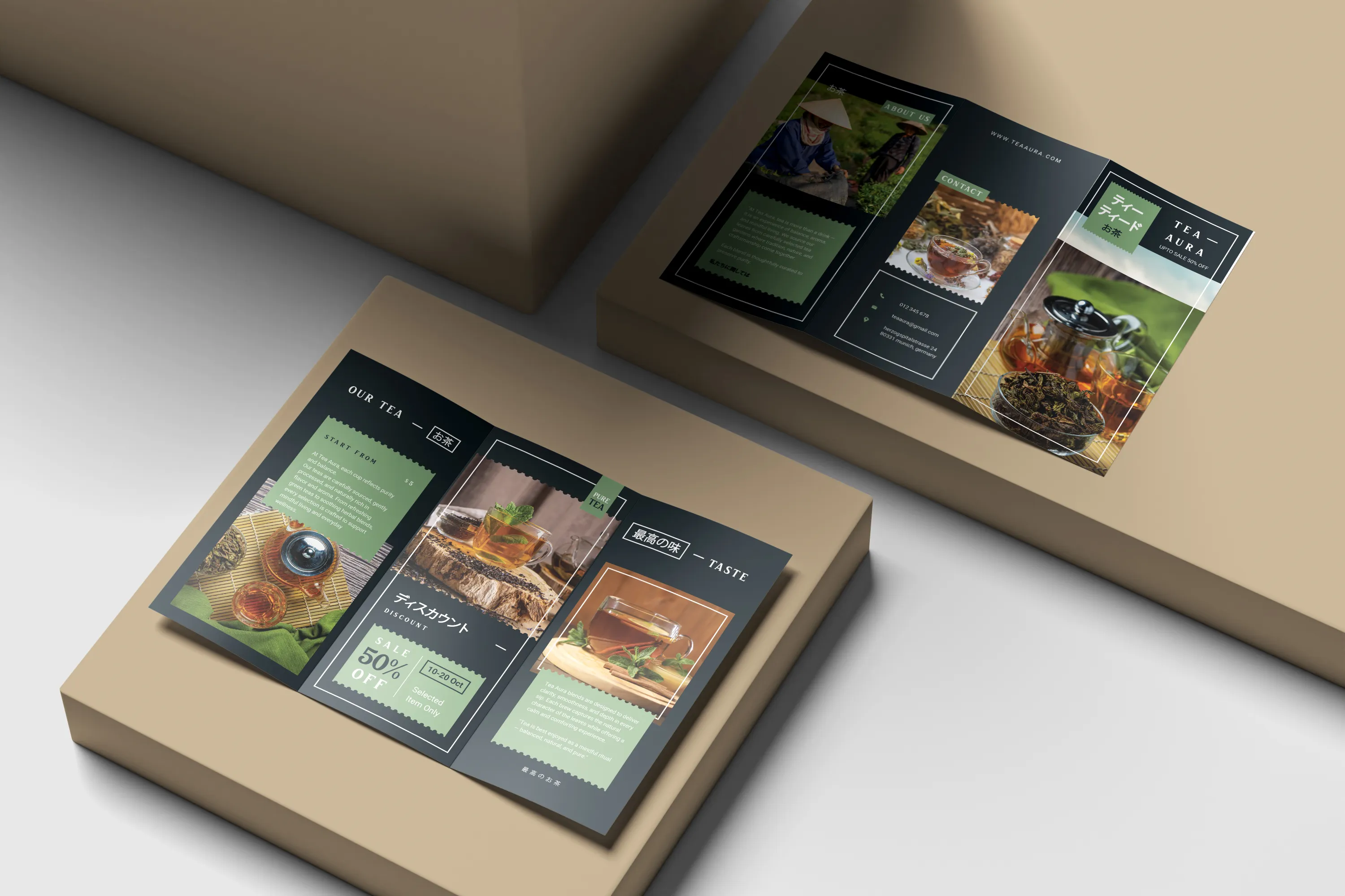
The purpose of this brochure design is to visually convey the serene, sophisticated, and sensual aspects of a high-end tea brand. Through careful design and visual language, the idea aimed to turn tea from a straightforward product into a mindful experience where tradition, flavour, and balance came together.
The design approach emphasizes clarity and flow across each panel, allowing the content to unfold naturally as the brochure opens. Soft colour tones, clean typography, and carefully curated imagery were used to reflect purity, warmth, and authenticity, qualities that closely align with the essence of tea culture. Each section was structured to guide the reader effortlessly, from understanding the brand story to exploring product highlights and offers.
Special attention was given to hierarchy and spacing so that text and visuals complement each other without feeling crowded. The brochure balances informative content with breathing space, creating a calm reading rhythm that mirrors the soothing nature of the product itself. Visual elements such as frames, stamps, and subtle contrasts help maintain consistency while adding character to the overall design.
This project highlights our ability to design print materials that are not just visually appealing, but also emotionally engaging and well-structured. The outcome delivers a cohesive brand presence that feels elegant, trustworthy, and inviting, making the brochure a strong extension of the brand’s identity.
Receive updates, insights, and useful tech information directly in your email.