


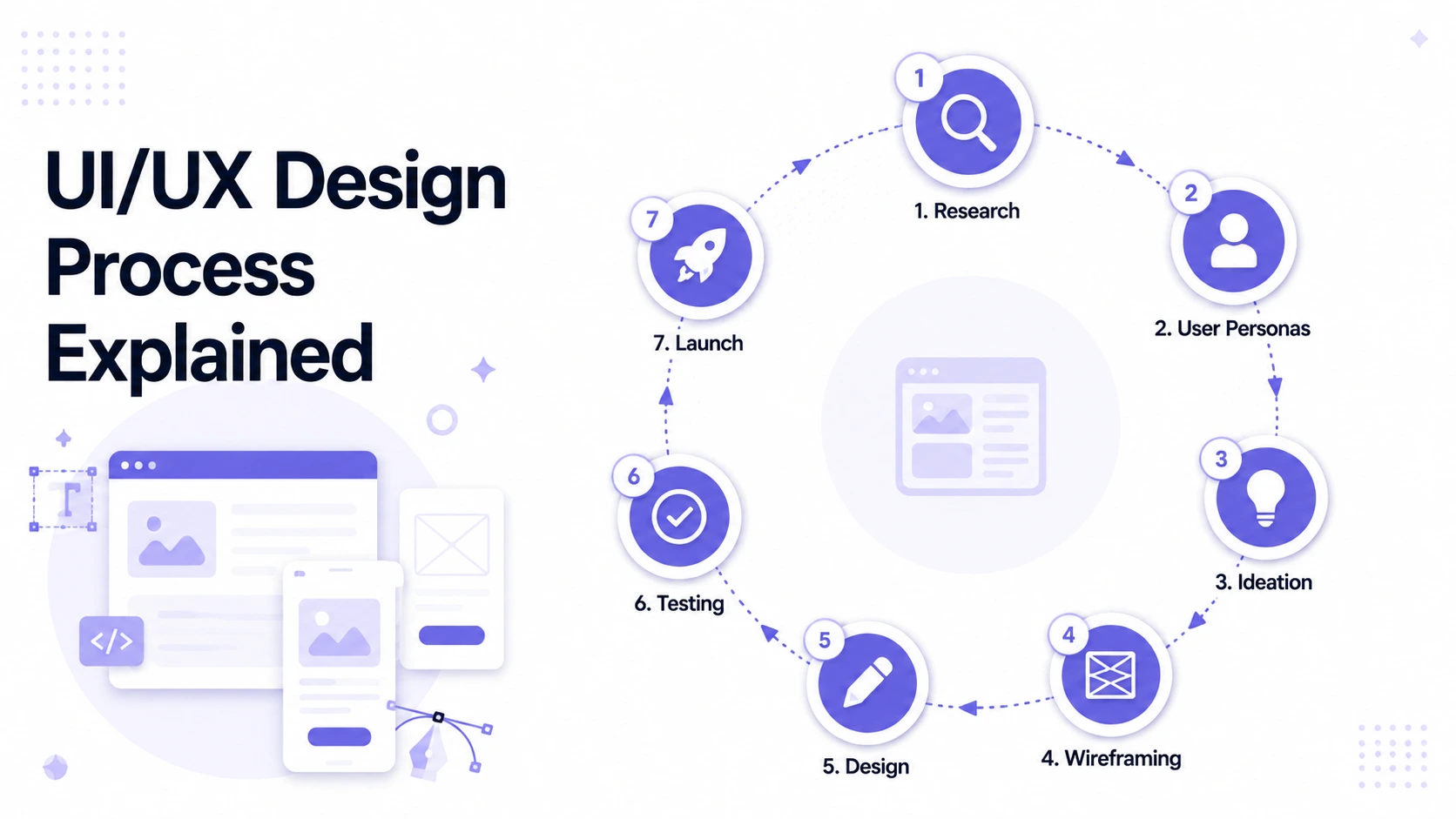
The UI/UX Design Process Explained
From user research to design systems, understand every stage of the UI/UX design process. A practical guide for teams building products in 2026.
Gaurang Mistry
07 August 2026
Most digital products fail not because the engineering was poor, but because the design was guessed at. Features get built before anyone confirmed that users wanted them in that form. Navigation gets structured around how the business sees itself rather than how users think about their needs. Interfaces that look polished in Figma fall apart the first time someone uses them on a phone in poor light.
The UI/UX design process exists to prevent exactly this. It is a structured approach to making design decisions that are grounded in research and tested before production so the product shipped is one that users can navigate without instructions and that achieves what the business needs it to achieve.
This guide covers every stage of the UI/UX design process, what each stage produces, why each step matters, and how the whole sequence fits together.
What Is the UI/UX Design Process?
The UI/UX design process is the series of stages a design team works through from the initial project brief to the final handoff of design assets to developers. It covers both UX (user experience) the logic of how a product works and UI (user interface) the visual execution of that logic.
The two disciplines are often treated as interchangeable, but they address different questions. UX design answers: Can users accomplish what they came here to do, and does the structure of the product support that? UI design answers: Does the interface look trustworthy, clear, and appropriate for the audience using it?
Both matter. A product with excellent UX but poor UI will feel unpolished and lose user trust. A product with excellent UI but poor UX will look good in a mockup and frustrate users the moment they try to do something real with it.
The design process that produces good outcomes integrates both, in the right order, starting with research.

Why the UI/UX Design Process Matters for Business
Skipping stages of the design process does not make a project faster. It moves the cost of mistakes from a stage where changes are inexpensive sketches, wireframes, prototypes to a stage where they are not: production code.
Usability issues found during prototype testing take hours to fix. The same issues found during QA, or worse, after launch, take days. User research that prevents a poorly conceived feature from being built at all saves weeks of engineering time. The design process is not overhead it is risk management applied to product development.
For businesses evaluating design partners or internal design workflows, a well-run UI/UX process also produces visible outputs at each stage that make progress trackable and decisions auditable. You can see what the design team discovered in research, why structural decisions were made the way they were, and what was tested before any code was written.
The 8 Stages of the UI/UX Design Process
Stage 1 - Discovery and Project Definition
Every design engagement starts before any design work begins. Discovery is the stage where the design team learns enough about the project the business goals, the users, the technical constraints, and the competitive landscape — to make informed decisions throughout the rest of the process.
What happens in discovery:
What discovery produces:
Discovery is the stage most frequently skipped on tight timelines, and skipping it is consistently where structural mismatches between business intent and design output begin. A two-day discovery phase at the start of a three-month design project is not time wasted it is the foundation everything else builds on.
Stage 2 - User Research
User research answers the question that subjective opinion and internal assumptions cannot: how do real users think about the task this product is trying to help them complete?
Good user research is not asking users what they want users frequently cannot articulate what they want with enough precision to be directly useful. It is observing how users currently handle the problem, what workarounds they have developed, where the friction is in their existing process, and what mental models they bring to the task.
Common user research methods:
Method | When to use | What it reveals |
|---|---|---|
User interviews | Early stage, before wireframing | Mental models, vocabulary, current workflows, pain points |
Contextual inquiry | Complex or domain-specific products | How users actually work in their real environment |
Survey | Large audience, quantifying patterns found in interviews | Frequency, prevalence, demographics |
Analytics review | Products with an existing user base | Where users drop off, what they interact with most, error patterns |
Competitor usability review | Establishing baseline benchmarks | Common patterns users are already trained on |
What user research produces:
The output of user research feeds directly into the next stage. Wireframes designed without user research are designed for a hypothetical user. Wireframes designed after user research are designed for the actual people who will use the product.

Stage 3 - Information Architecture
Information architecture (IA) defines the structure of a product how content and functionality are organised, labelled, and made navigable. It is the skeleton of the user experience before any visual design is applied.
IA decisions are among the hardest to reverse once a product is built. A navigation structure that makes logical sense to the business can be completely opaque to users who think about the task differently. Changing the navigation of a live product with an established user base is a significant undertaking with real conversion risk. Getting it right before development begins is substantially less expensive.
Information architecture activities:
What IA produces:
Check this: Saturncube case studies
Stage 4 - Wireframing
Wireframes are low-fidelity representations of a product's screens. They define what appears on each screen, where it appears, and how it responds to user interaction without visual design decisions like colour, typography, or imagery that introduce aesthetic preferences into structural conversations.
The purpose of wireframing is to evaluate structural decisions at the stage where changing them is least costly. A wireframe represents hours of work. The same structural decision baked into a polished high-fidelity design represents days of work to revise.
Types of wireframes:
Low-fidelity wireframes use basic shapes and placeholder text to define layout and content hierarchy. They are appropriate for early-stage structural alignment with stakeholders before any detail is added.
High-fidelity wireframes define component-level detail — exact content, interaction states, form behaviour, error states, empty states, and edge cases. These are the documents developers reference for structural implementation.
What wireframing produces:
A common mistake at this stage is treating edge cases as secondary. Edge cases are the moments where user trust is most fragile. A product that handles its happy path elegantly but shows a blank screen or an unhelpful error message at first login will lose users at exactly the moment they were forming their first impression.
For an example of how this stage works in practice on real client projects, see Saturncube's UI/UX Design services, which covers how wireframes are integrated into the broader design and development workflow.
Stage 5 - Prototyping
A prototype is an interactive simulation of the product built from design files not production code. It behaves like the real product, can be navigated by a user, and produces realistic responses to interaction but it can be modified in hours rather than days.
Prototyping is the bridge between a static design document and a testable experience. It answers the question that wireframes alone cannot: does this design actually work when someone tries to use it?
Types of prototypes:
Click-through prototypes link screens together so the basic navigation flow can be tested. They reveal whether users can find what they are looking for within the proposed structure.
Interaction prototypes simulate specific interface behaviours transitions, animations, form validation, loading states. They answer whether the designed interactions feel appropriate for the context.
Functional prototypes (built in tools like Framer or with coded components) closely approximate the real product behaviour. These are appropriate for complex interactions where the difference between the design and the real implementation would otherwise be difficult to evaluate in testing.
What prototyping produces:

Stage 6 - Usability Testing
Usability testing is the systematic process of observing real users interacting with a prototype to identify problems in the design before production. It is not a validation exercise the goal is to find problems, not confirm that the design is good.
This distinction matters because confirmation bias is a genuine risk in design review. Stakeholders and designers have all invested effort in the design and have a natural tendency to interpret ambiguous user behaviour charitably. A structured usability testing process forces honest evaluation by observing what users actually do rather than interpreting what they probably meant.
Usability testing approaches:
Moderated testing: a facilitator observes a participant complete defined tasks with the prototype, asks follow-up questions, and notes where confusion, hesitation, or error occurs. This produces the richest qualitative data.
Unmoderated remote testing: participants complete tasks independently, with sessions recorded for review. This scales to larger participant counts but loses the ability to probe specific moments with follow-up questions.
A/B testing: two design variants are tested against each other with a defined success metric. This requires enough traffic to produce statistically significant results, so it is generally appropriate for later-stage optimisation rather than early discovery.
What usability testing produces:
Five users in a moderated usability test will surface approximately 80% of the significant usability issues in a design. This is a well-established finding in usability research. A five-user test is a realistic investment for most projects; a 500-user test is not necessary to find the issues that matter.
Stage 7 - Visual Design (UI Design)
Visual design is the stage where the validated structure from wireframing and testing receives its visual execution colour, typography, iconography, imagery, motion, and the visual hierarchy that guides user attention.
UI design in a well-run process is not decoration applied to wireframes. It is a separate discipline with its own principles and decisions that affect usability as much as aesthetics.
Key UI design decisions:
Visual hierarchy - the use of size, weight, contrast, and spacing to direct attention to the most important elements first. A page where everything competes for attention equally communicates nothing.
Colour system - brand colours applied systematically to create meaning through consistency. Primary actions use primary colours. Destructive actions use red. Disabled states use muted values. Users learn this vocabulary and apply it throughout the product without realising it.
Typography system - a defined set of type styles (headings, body text, captions, labels) applied consistently so users can read the interface quickly rather than re-orienting to varying text treatments from screen to screen.
Component design - the visual execution of every reusable element: buttons, form fields, dropdowns, cards, modals, navigation elements, and notifications. Each component is designed in all states it can appear in (default, hover, active, disabled, error, loading) rather than just the happy-path default.
What UI design produces:
Our main service: Web Development services
Stage 8 — Design System Creation and Developer Handoff
The final stage of the UI/UX design process is ensuring that what was designed is what gets built. This requires a design system and a handoff process that gives developers the information they need without requiring repeated designer involvement for clarification.
Design system components:
A design system is the single source of truth for a product's visual and interactive language. It contains:
Developer handoff:
An effective handoff includes annotated Figma files that explain every measurement, state, and interaction without requiring the developer to ask for them. It also includes a walkthrough session where the designer reviews the files with the development team, answers structural questions before build begins, and documents the answers for future reference.
The handoff is not the end of design involvement. Designers should remain available during development to review implementation against design intent, catch drift between the approved design and what is being built, and resolve ambiguities that only become visible once the real interface is being assembled
The UI/UX Design Process in Modern Product Development
The traditional linear design process described above works well for greenfield products with a defined scope. Most modern product development is neither greenfield nor fully defined, which is why contemporary UX practice has adapted.
Agile UX integration: Design runs one sprint ahead of development — completing the wireframes and validated designs for Sprint 3 while development is implementing Sprint 2. This keeps design informed by what engineering is discovering rather than producing designs in a vacuum.
Continuous discovery: Rather than a single upfront research phase, teams maintain an ongoing cadence of user research regular interviews, usability testing, and analytics review that informs design decisions throughout the product lifecycle.
Design systems as shared infrastructure: Rather than designing each new feature from scratch, mature product teams maintain a shared design system that new features are built from. This accelerates design velocity and ensures consistency without requiring every decision to be revisited.

Tools Used in the UI/UX Design Process (2026)
The tooling landscape has consolidated significantly in the last five years, with Figma establishing itself as the dominant platform across most of the industry. Supporting tools vary by team and project type.
Stage | Primary Tools | Notes |
|---|---|---|
Research | Dovetail, Notion, Miro | Dovetail has emerged as the standard for research synthesis |
IA and card sorting | Optimal Workshop, Maze | Tree testing and open card sorting for navigation validation |
Wireframing | Figma | Figma's component system makes wireframe-to-prototype transitions fast |
Prototyping | Figma, Framer | Framer for high-fidelity interactive prototypes; Figma for click-through |
Usability testing | Maze, UserTesting, Lookback | Lookback for moderated sessions with video; Maze for unmoderated |
Visual design | Figma | Broad adoption has made cross-team collaboration simpler |
Design systems | Figma + Storybook | Storybook bridges design tokens from Figma to front-end component documentation |
Handoff | Figma Dev Mode | Eliminates most inspect-and-measure friction for developers |
The tools matter less than the process they support. A well-run design process with basic tooling produces better outcomes than a poorly run process with premium tooling.
Common Mistakes That Break the UI/UX Design Process
Understanding where the process typically goes wrong is as useful as understanding the stages themselves.
Starting wireframes before research is complete. This is the most common mistake and the one with the most downstream consequences. Wireframes built on assumptions are revised throughout the project as those assumptions are disproved by later testing. Wireframes built on research findings stay stable.
Treating the prototype as a deliverable rather than a testing tool. A prototype is a means to an end. Its purpose is to be tested and revised, not reviewed and approved. Organisations that treat prototype approval as a milestone are often approving designs that have not been tested with users.
Skipping edge cases in wireframes. Designs that only document the happy path leave development teams to make their own decisions about error states, empty states, and edge cases which produces inconsistency and often poor user experience at exactly the moments users most need guidance.
Detaching design from development during build. A design handoff is not the end of design involvement. The gap between approved designs and shipped product widens significantly when designers stop reviewing implementation. A weekly design review during development catches drift before it accumulates.
Building a design system as an afterthought. Design systems built after a product is live require reconciling inconsistencies that have already accumulated across dozens of screens. Building the system during initial design even a lightweight one is substantially less expensive.
Our latest blog: Flutter vs React Native 2026 blog post
Frequently Asked Questions About the UI/UX Design Process
How long does the UI/UX design process take?
The timeline depends on the scope of the product and the project type. A focused MVP with a defined set of user flows takes 4 to 8 weeks from discovery to developer handoff. A large enterprise product with multiple user roles and complex workflows typically takes 3 to 6 months for the initial design phase, with ongoing design activity continuing through development and after launch.
What is the difference between UX design and UI design?
UX design addresses the logic of how a product works structure, flow, information hierarchy, and the interaction patterns that let users accomplish their goals. UI design addresses the visual execution of that logic colour, typography, component design, and the aesthetic language that communicates professionalism and brand. Both are required for a product to work well and look appropriate.
Do I need a full design process for a small project?
The stages scale with project scope rather than being all-or-nothing. A small project might compress discovery into a half-day workshop, skip moderated usability testing in favour of a quick prototype review with internal stakeholders, and produce a simplified handoff. What does not scale down usefully is starting visual design before the structure is agreed — that specific order matters regardless of project size.
What does a UI/UX designer deliver?
The deliverables depend on the stage and scope, but typically include: research synthesis (personas, journey maps, insight summaries), information architecture (sitemap, navigation structure), wireframes (low and high fidelity), interactive prototype, usability test findings, visual design files (high-fidelity screens at all required breakpoints), component library, design system documentation, and annotated developer handoff files.
How do I know if the UI/UX process is working?
The process is working when: designs change primarily because of what testing reveals rather than because of stakeholder preference, development teams rarely need to ask designers for clarification during build, post-launch usability issues are rare or minor, and users can complete their core tasks without instruction.
Conclusion
The UI/UX design process is not a series of bureaucratic gates before development can begin. It is the structured approach that closes the gap between what a business intends a product to do and what users can actually accomplish when they use it.
Each stage has a purpose that cannot be replicated by the stages around it. Research tells you what to design. Information architecture tells you how to structure it. Wireframing and prototyping let you test the structure before committing development resources to it. Visual design makes the tested structure trustworthy and appropriate to the context. A design system makes the visual language sustainable as the product grows.
Skipping stages does not reduce cost it relocates cost to where it is more expensive to absorb.
If you are planning a product or redesigning one that is not performing, the Saturncube UI/UX design team works through every stage of this process for web and mobile products across multiple industries. The initial consultation is free.